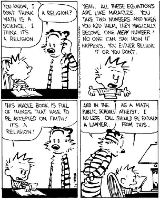
Calvin and Hobbes by Bill Watterson is loved by many as one of the greatest comic strips of all time. The above strip shows why it is so loved. It combines the humor of small children, simplicity of design and satire of current events to create a delightfully funny and yet pointed statement.
In this particular strip, Calvin, a first grader who hates all things educational (except dinosaurs) is attempting to do his math homework. As is his usual habit, he attempts to find a way around it. This time, he decides math is essentially a religion in which addition and subtraction problems constitute miracles. He then explains that he doesn’t believe the “religion” and declares himself a “math atheist.” Hobbes, Calvin’s stuffed tiger that is alive in Calvin’s imagination, is always the sensible one in the strip. As the more logical of the two, he realizes the teaching of the mathematical “religion” in public schools violates the separation of church and state. Thus, the strip is meant to be humorous and still maintain a connection to the readers’ lives.
As with many other comics, one of the first things to catch the viewers’ attention Calvin’s ridiculously big head, relative lack of height, and simply-drawn face and hands ask the viewer to accept the strip as what it is—a fanciful look into the life of a first grader. After all, what first grader understands the concept of religion in school so thoroughly? The same applies to Hobbes. This strip doesn’t show it, but whenever another character is in the frame we see Hobbes as a mute stuffed tiger—as everyone but Calvin sees him. Watterson again expects us to ignore impossibilities for the sake of the humor and satire of the piece. This is also illustrated by the outside-the-lines drawing of Hobbes’ stripes, the fact he is standing erect, and his exaggerated facial features.
The basic mechanics and norms of Calvin and Hobbes are followed pretty strictly. We are not asked to guess which characters are speaking or in what order the characters are speaking. There is also very little ambiguity in what the characters mean or imply. In other words, in the case of mechanics it is a very standard newspaper comic strip.
The typography used in Calvin and Hobbes is very telling to the internal context of the strip. It is written in an all-caps font with errors in mechanics such as slanting (which is most apparent with exclamation points). It also looks very childish, which correlates with the six-year old main character. However, it is serious and readable enough that the audience does not lose the message and most likely will not consciously notice it without reading several strips.
Calvin and Hobbes is a classic among newspaper comic strips. Through simplicity and imagination, yet attention to mechanics of the genre it manages to be both humorous and pointed at the same time. Watterson created a masterpiece in Calvin and Hobbes, and this piece exemplifies that genius.
No comments:
Post a Comment